Design & Brand
Matching Balloon Colors to Your Brand Palette
How a corporate brand palette translates into physical event décor, why an exact hex match rarely exists, and how real Bay Area installations handled brand colour.
- By
- Balloon Décor
- Published
- Reading time
- 6 minutes
A brand hex value almost never exists as a physical material, so matching a corporate palette in event décor is a translation problem rather than a lookup. Balloon Décor works from your brand guidelines, identifies the closest available tones, and composes them so the installation reads as your brand colour at the distance people will actually see it from. The eye judges relationships between colours, not absolute values.
That is the whole method, and understanding it changes what you should send a décor vendor.
Why an exact match is the wrong target
Three things sit between a brand book and a finished installation.
Material limits the gamut. Available colours are manufactured ranges, not a continuous spectrum. Some corporate blues, most corporate greens and nearly every corporate purple fall between two stocked tones rather than on one.
Finish changes perceived colour. The same nominal colour in matte, metallic, pearl or clear-over-tint reads as a different colour under light. A metallic silver and a matte silver photograph as two separate colours in the same room.
Venue light rewrites everything. Warm tungsten in a hotel ballroom pushes colours yellow. Daylight through a lobby window is cooler and far more revealing. Stage wash from an AV rig can be any colour at all. An installation approved on a screen under office lighting will not look identical in the room.
The practical consequence: a vendor promising an exact match to a hex value is either using printed elements, or has not thought about it.
What actually works: composition over substitution
When a brand colour sits between available tones, the reliable approach is to build with two or three adjacent tones rather than forcing a single approximation. At viewing distance the eye blends them and settles on the intended colour, and the variation reads as depth rather than as error.
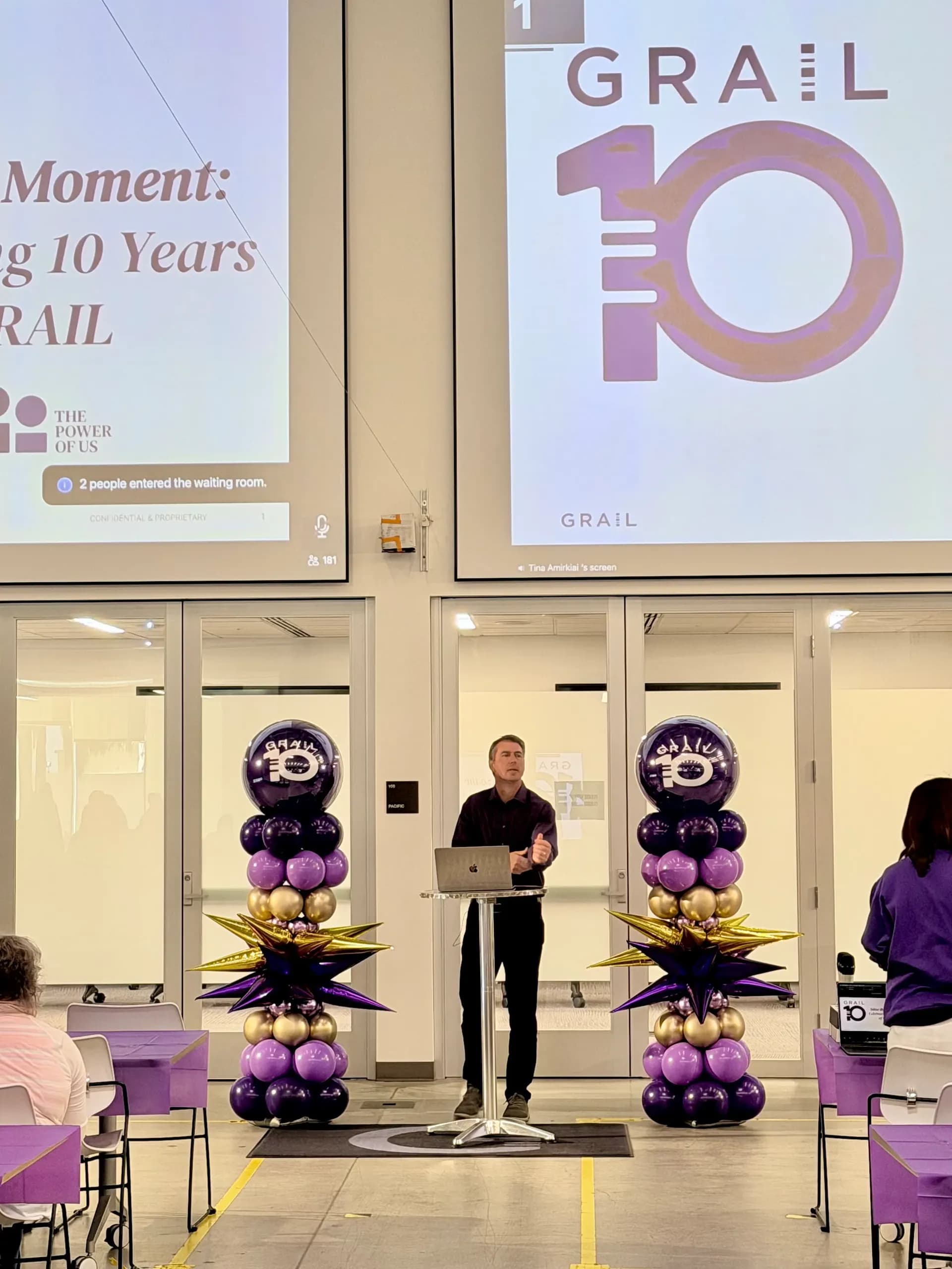
This is visible in real work. The GRAIL 10-year anniversary installation was built in purple, lavender and gold — the lavender is what makes the purple read as purple rather than as a flat block, and the gold provides the contrast that stops the whole thing going muddy under warm room light.
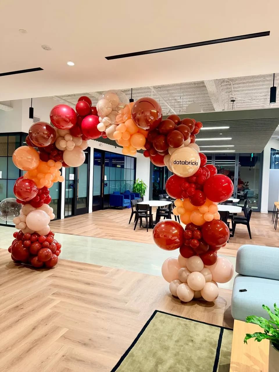
The same logic runs the other way on softer palettes. The organic balloon arch for the Databricks corporate office event in Silicon Valley used burgundy, peach, cream and clear. The clear elements are doing structural work visually: they break up density so the burgundy has somewhere to sit without dominating an office space.
The three roles every corporate palette needs
Most brand guidelines define a primary colour, a secondary, and a set of accents. Physical décor needs a different breakdown, and translating between the two is the useful part of the conversation.
The carrier. The colour that occupies most of the installation. It has to be a tone that holds up in volume without becoming oppressive. Very saturated primaries rarely work as carriers in an interior space.
The identifier. The colour that makes the installation recognisably yours. This is usually the brand primary, used in smaller proportion than clients expect. Placement matters more than quantity here.
The separator. A neutral, metallic or clear tone that keeps the other two from blending into a single mass. Cream, white, clear, silver and gold all do this job. Most installations that look cheap are missing this element rather than having the wrong brand colours.
A useful exercise before briefing: take your brand palette and assign each colour one of those three roles. If two colours want the same role, the design will fight itself.
What to send a décor vendor
Send the brand guidelines document, not a description. Specifically:
- Hex or Pantone values for primary and secondary colours. These set the target even though they cannot be hit exactly.
- The ratio rules, if your brand has them. Some brand systems specify that the primary never exceeds a share of a composition. That governs the design.
- Photographs of the venue, or at least the room name. Lighting decides half the outcome.
- One reference image of an installation whose feel is right. Not to copy — to calibrate whether "modern" means minimal or means maximal, because it means both to different teams.
- What the installation is for. Photography, arrivals, stage backdrop, or all three.
What not to send: a screenshot of a colour from a slide deck. Screen colour is unreliable, and it puts the vendor in the position of matching a rendering of your brand instead of your brand.
When brands say "our colours" and mean something looser
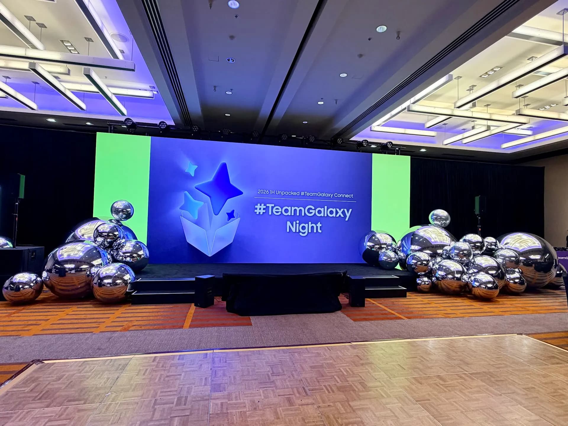
Plenty of corporate events do not want a literal brand-colour installation. Launch events in particular often run a campaign palette that differs from the corporate one, and the décor has to follow the campaign. The Samsung app launch in San Francisco was built to the event's own colour direction rather than to a corporate style guide, which is common for launch work where the product, not the company, is the subject.
Ask internally which of the two you are working to before the first design round. It is the single most common cause of a re-design at proposal stage.
Colours that photograph well, and colours that fight the camera
Since most corporate décor exists partly to be photographed, it is worth knowing which choices help:
| Choice | Effect in photographs |
|---|---|
| Two dominant tones plus a neutral | Reads cleanly, subject stays visible in front of it |
| Metallic finishes | Strong under directional light, can blow out under a bright stage wash |
| Clear or translucent elements | Add depth without adding colour weight |
| Four or more saturated colours | Competes with clothing and skin tones, busy backgrounds |
| Very dark palette on a dark wall | Disappears; needs a lighter separator to hold its shape |
The black-and-white palettes used on corporate installations are a good illustration of the last row — they only work when there is enough tonal contrast in the surrounding space for the shape to register.
Where colour decisions get locked
Colour should be locked at design confirmation, before material is ordered, and it should be locked against a physical or photographic reference rather than a screen. If your brand shade needs an ordered material rather than stock, that decision has its own lead time — which is one of the reasons décor lead times run to several weeks for anything with strict colour requirements.
If you are planning a branded installation for a Bay Area corporate event, our branded balloon installation service covers brand-colour design, logo and signage integration, entrances, backdrops and hanging installations. Send your brand guidelines and your venue with a corporate event proposal request and the first concept will already be built around your palette rather than a generic one.
Written by Balloon Décor, a corporate event décor company serving San Francisco, the Peninsula, Silicon Valley and the wider Bay Area. About Balloon Décor.